Wittner 'Vertical Garden'


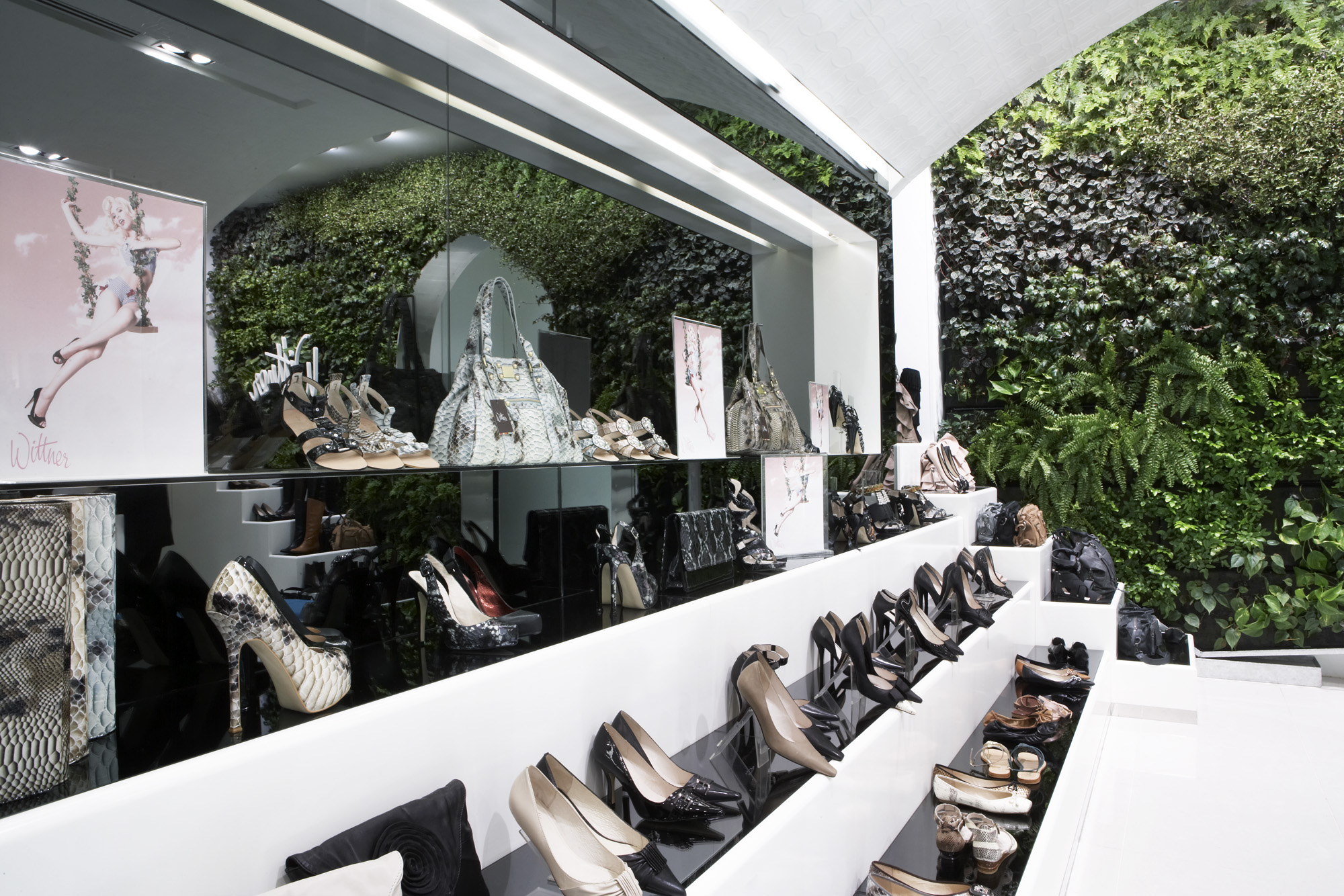
Far from the bland and boxy, a detached haven from the bustle of the megaplex has been created with this Wittner shoe store in Chadstone, Melbourne.
It’s intriguing (and a great relief) to see how far the suburban shopping megaplex has come. As a wide-eyed ‘tween in the 1980s, it didn’t seem to matter that the mall was a shrine to banality - a generic collation of rectangular prisms demarcated by little more than logos and slogans. I was happy to thumb through compilation cassettes, eat Whoppers and generally pretend to be Corey Feldman.
But in 2010, the average consumer is so much more sophisticated. They want more than just products and price tags - they demand “experience.” And while many large corporations are pumping millions of dollars into “experiential marketing” in their pursuit of real world connections between brand and consumer, many more have realized that the retail storefront is ground zero for brand positioning. Smaller operators have for some time been engaging emerging designers to create bespoke retail spaces in the hipper parts of our capital cities. Now this approach has infiltrated the suburban megaplex. The trick, of course, is to create a unique retail space within the strict limitations of a generic shopping mall tenancy; to think outside the box while designing within it.
Melbourne-based retail design specialist Luke Cannon has done just that with this impressive new fitout of Wittner’s flagship store at Chadstone Shopping Centre in Melbourne. Indeed, one of the studio’s key design strategies - the insertion of a dramatic curved ceiling - immediately tempers any perception of the space as a box. Stepping through the entrance marks a clear and palpable transition from the noise and bustle of the mall into a more intimate and relaxed environment.
The other major design manoeuvre was the installation of a vertical garden at the far end of the store. Like the curved ceiling, the verdant green wall quietens the space down, mitigating the chaotic razzle-dazzle of the megaplex and creating for the customer a feeling of separation from the masses.
CLIENT
Wittner
WHAT WE DID
:- Customer Insights
:- Brand personality positioning
:- Shopper profiling
:- Customer journey planning
:- Zoning and category planning
:- Interior design
:- CAD Documentation
:- Design Management
:- Project Management
STORES
20+


